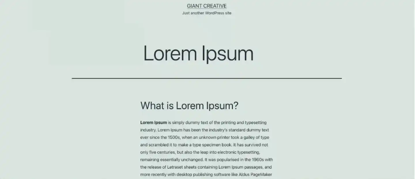
Font, type, lettering, script, whatever word you choose to use, typography in advertising deserves a lot more credit than it is usually given. When we think of graphic design, our minds quickly go to bold imagery, or delicate details but rarely do we consider the role that type plays in creating the overall aesthetic and meaning of a piece.
Type is one of the more important yet most widely misrepresented and misunderstood aspects of advertising. Typefaces often get dulled down into two categories, serif and san serif, and are often seen only as a way to convey information.
However, the style, sizing, placement, and font itself are all facets that graphic designers do not take lightly and are aspects that play a vital role in the success of design projects and their campaigns. In this blog, our marketing team is going to show you the relationship between Typography and digital advertising.
What is Typography?
Typography put simply is the art of arranging and designing type. There are many different aspects that go into typography including the selection of typefaces, point size, line length, line-spacing (leading), adjustment of space between groups of letters (tracking), and adjustment of space between pairs of letters (kerning). When writing emails or drafting a document, all of these components are usually preset for you, but in the world of graphic design, it’s up to the designer to make these important choices on their own.
Typography is nothing new to web designers and advertisers. It has long been used as a way to set the theme or mood of promotional content by drawing attention to specific fonts being used to convey different messages to the reader. Effective typography, combined with the designer’s use of colours, shapes, and images, is what makes for a successful final product.
Let’s Set the Mood with Fonts
Typefaces can be BOLD, timid and everything in between and the expressiveness of simply the lettering itself can be a huge indicator of how your messaging is going to come across. A good designer will know how to use this to their advantage, amplifying the meaning of the words written with how the word actually appears.
Observe the different fonts below and see if you agree with the personality, we believe they are giving off. While some fonts appear stern or serious others can come across as very fun and lighthearted. There’s a font for almost every tone or emotion.
Effective Typography in Advertising
Choosing fonts that establish the personality of the text may seem like the most important task when working with typography but there are also some general housekeeping rules that must always be followed if a designer doesn’t want their hard work to go to waste. As advertisements have become more web-dominant, designers have had to pay even more attention to typography, as nothing screams poor design louder than typography that is poorly selected when viewed on the web.
Let’s explore some rules when dealing with type.
Keep it simple: Using too many fonts or styles can be confusing for viewers and take away from the overall design of the piece. Sticking with a minimal number of fonts establishes consistency (see next point) and creates a more visually pleasing composition.
Keep it consistent: Consistency is key when it comes to typography. Type can be a really strong way to establish a brand and companies can use this to their advantage when establishing a cohesive brand identity. By keeping fonts consistent across company promotional ventures, audiences are able to create connections between fonts, advertisements, and companies.
Visibility: This is very important on the web page. Text is meant to be read and if the sizing is too small or the background makes it illegible, the entire design will suffer. Working with text and imagery together can be tricky and layering the two can create visibility issues. Because of this, it is of the utmost importance that designers always keep the sizing, colour, and contrast of text at the forefront of their minds.
Contrast: Maintaining adequate contrast can take an illegible design to a powerful creative that can drive meaningful engagement. Contrast can also help organize your design by highlighting the most important elements by drawing a user’s eye to an area. A focal point can be established by adding visual interest.
Hierarchy: By using varying sizes of text, viewers are able to distinguish between the most important aspects of your design and those which they should digest at a second glance. This also allows hurried viewers to pick out the most important parts of your ad and retain information even if they do not view all the details.
In conclusion
As we can see, typography plays a vital role in the advertising world and for designers, this doesn’t come without its challenges. There are many different approaches that can be taken in regard to type but it goes without saying that almost all advertisements require some use of this seemingly simple yet deeply tricky medium of expression. From announcements to calls to action to company slogans, typography and its importance should not go unnoticed. So, next time you see your favourite ad, or your least favourite for that matter, take a moment and pay extra attention to its typography and see just how significantly its look, feel and approach are impacting the overall design and its effectiveness.


